Admissions CRM
Putting the counsellor's
desk in their pocket.
How we translated a dense, data-heavy web admissions dashboard into a focused mobile companion without asking counsellors to give up the numbers they rely on.
Bringing a complex CRM to Mobile
The Problem: Desktop CRM Overload


Existing CRM is Complex & Desktop Heavy
The existing experience worked well on desktop. The next step was making it work on mobile.

On the go Access is Critical but Lacking
Counsellors need quick access to lead and application data away from their desks.

Slow Response Times Hurt Lead Conversion
A demanding mobile experience negatively impacts the ability to act quickly on leads.
The Solution: A Focused Mobile MVP


A Simplified Role -Based Mobile Experience
Tailored dashboards for admins and counsellors reduce noise & improve task efficency.

Core Features for On-The- Go Productivity
Includes role based dashboards, lead management & application tracking for essential tasks.

The Result: Higher Operational Efficiency
Enables teams ti act faster, reduce cognitive load and stay productive anywhere.
From desk-bound CRM to mobile.
Lead Matrix is an admissions platform that gives counsellors and managers a complete view of leads, follow-ups, campaigns, dispositions and conversions. But the web app is built for a desk, while counselling often happens on the move between calls, meetings and rooms.
The challenge wasn’t to squeeze the web app onto a smaller screen. It was to bring the things counsellors need most into a mobile experience making it easier to follow up with leads, spot important updates and keep things moving, wherever they are.
The product, in motion.
The full working prototype is embedded below. Tap through the bottom tabs, open a lead, expand a card, and explore the campaign dashboard. Everything described in this case study can be experienced here.
Fully interactive prototype
Same data. A different way in.
The web shows everything at once. Mobile earns attention one layer at a time - summary first, detail on demand.
Five moves that simplified a complex experience.
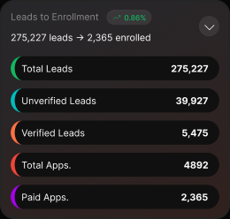
Summarize first, explore when needed
Instead of showing large reports upfront, each section starts with a simple summary. Channel Summary, Lead Status and Lead Classification show the key number first, with more detail available when needed.
Tables that keep the context
For wider tables, the identifying column stays fixed while the rest can scroll horizontally. This makes it easier to keep track of which lead or row you're looking at.
Accordions to reduce scrolling
Sections like Lead Timewise and Lead Status are condensed into a short takeaway first. Users can expand them when they need the full details.
Ranking to surface what matters
Rather than showing every campaign at once, the mobile view highlights the Top 10 by paid applications, with the complete table still available when needed.
Charts designed for touch
Charts are paired with tappable labels and clear legends, making the data easier to explore on a smaller screen without relying on precise hover interactions.
Following a counsellor through the day.
The real test of mobile accessibility is simple: can a counsellor get through their day without needing to go back to a laptop?
Know what needs attention
The home screen surfaces Quick Stats and Needs Follow-up, bringing Interested and Call Back Later leads upfront. From there, one tap takes them to the full Leads list.
Everything a lead needs, one screen
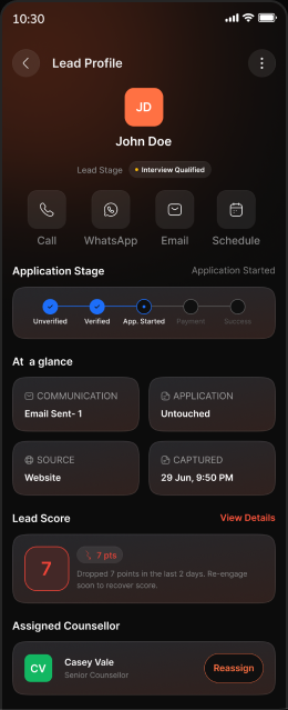
A lead’s score, history and key actions are available in one scroll. Counsellors can call, message or update a disposition directly from the lead.
Know when to reach out
Lead Timewise tells the counsellor which 2-hour slot converts best, so callbacks are scheduled for when paid applications actually happen a web insight, now usable in the moment.
See where leads are coming from
Top 10 Campaign Sources and Channel Summary let a counsellor see which campaigns and channels are producing paid apps, and drill into source / medium / campaign the web's attribution story, made tappable.
See where you stand
The Counsellor Leaderboard brings paid applications and conversion rates together, making performance easy to check from the same device.
The counsellor doesn’t need to wait until they’re back at their desk. Follow-ups, lead actions, timing, attribution and performance are all accessible from one place, on the go.
A few principles guided every decision.
The goal was to make the mobile experience feel natural to use, not like a smaller version of the web app.
Lead Matrix Mobile - Admissions CRM · Mobile companion case study